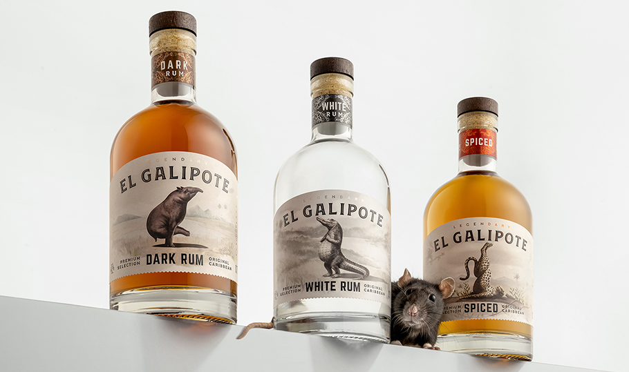
El Galipote | Sept 2024
El Galipote is a mysterious creature wondering the dense forests of Caribbean Islands. Able to transform into human shape and gifted with supernatural powers, it is the source behind countless folk tales and eyewitness accounts. We have used the legend as an inspiration for a new rum brand from Vilniaus Degtine, called El Galipote. For packaging designs, we employed indigenous Caribbean animals that we transformed into animals with human characters.
FILTER WORK

LRT | May 2022
We conducted a complete visual identity revamp for the Lithuanian national broadcaster, Lithuanian Radio and Television Group. The revamp included an overhaul of brand architecture with more focus given to sub-brands, a development of the complete visual design system including redesign of mother brand LRT, redesign of sub-brands LRT TV, LRT Plius, LRT Lituanica, LRT Radijas, LRT Opus, LRT Klasika and LRT.lt and development of the visual language for each sub-brand including ident and of on-air promos creation.

Obeliu Crafted Vodka | Oct 2020
A brand name, bottle and label design, as well as a website we created for Obeliu Crafted Vodka, a super-premium vodka from Vilniaus Degtine. This vodka is made from spirits sourced from the Obeliu Distillery, built in 1907 by Jonas Psezdeckis, the last Count of Rokiskis. The front label features a photograph of Countess Katerina Komaraite Psezdeckiene bottling the Obeliu spirits in 1930.

Coffee Address | Aug 2018
A brand name, visual identity design and line of packaging we developed for the house-blend roasted beans from Coffee Address.

Osta | Sept 2017
A visual identity we designed for Osta (Harbor), a Daugava riverfront restaurant. In addition to visual materials, the comprehensive visual identity covered a variety of needs such as the interior, apparel and even the crockery. A mix of graphic design, proprietary illustrations and even a handwritten menu were to create the restaurant’s own language.
Zabolis Partners | May 2016
A visual identity and corporate website we designed for Zabolis Partners, a private equity firm specialising in the real estate, sustainable energy, e-commerce and financial technology sectors. We emphasised the firm’s internal motto of always starting a project from a blank page.
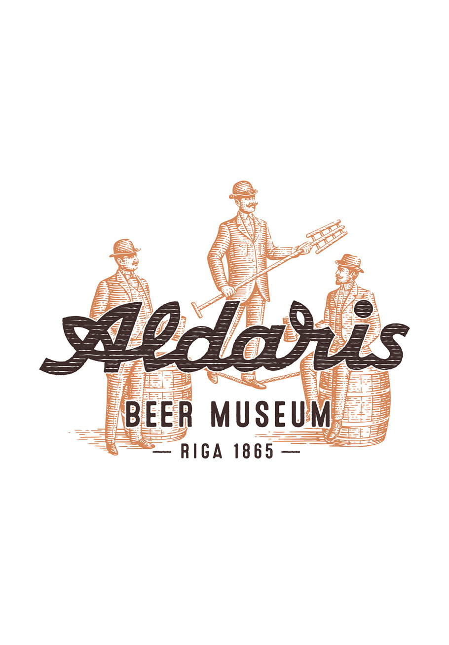
Aldaris | Apr 2015
A special visual identity we developed for Aldaris Alus Darbnica. It was inspired by the legendary European Brewers Congress that took place in 1906, where one hundred brewmasters from Europe met at the Waldschlosschen Brewery (the historic name of Aldaris) in Riga to discuss the secrets of their craft. The visual identity was specially developed for the museum’s purposes and is used for special small-batch beer packaging produced on the museum’s premises.

Vilnius Comedy Fest | Nov 2015
A multi-award-winning visual identity and campaign we created for the first-ever comedy festival in Lithuania, Vilnius Comedy Fest. The logotype of the festival is a reinterpretation of the Vilnius coat-of-arms, and the campaign addresses the notoriously serious local population.
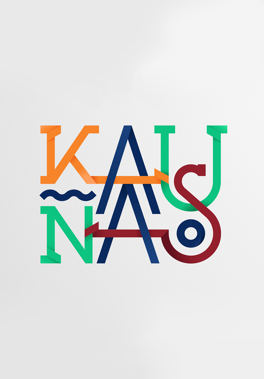
Kaunas City | Jan 2014
A visual identity system we developed for Kaunas city. The logo of Kaunas is made of stripes in various colours (designed to reflect the different layers of city life, from business to modern culture and from history to sport) that bend, cross each other and interlace. The interlacing design principle underlines the open spirit and versatility of Kaunas city and extends beyond the logo to build a comprehensive visual identity that seamlessly engages with the environment.

Svyturys | Feb 2015
A very delicate design work for an iconic and exceptionally busy Svyturys logotype, aiming to give the logo a modern, quality feel with little to no actual changes to the design. The redesign of the logotype retained the profusion of all the elements, and a great deal of effort was spent improving the comprehensibility of the symbols. Dozens of designs were executed and tested for every logo element from the shape of the eagle feathers to the width, kerning, and outline of the lettering. The style of these elements was modernised and their execution was unified by means of hand drawing. Subsequently, a lot of thought was given to an elegant merger of these elements and a gentle rebalance of the logotype’s priorities to ensure a stronger impact. Finally, the logotype was reproduced in a vector format.

Mr. Plume | Nov 2013
The brand name, visual identity and packaging we developed for Mr. Plume, a cider created by a Latvian musician who learned cider brewing in Austria and returned to his home city of Jumprava to produce his own ciders. We also helped Martin Plume to win a financial grant on the TV show ‘Company Secret’ to kick-start his business. As the name Plume sounds very much like plum, a lighthearted and paradoxical brand name was employed – Mr. Plume – for a cider made by a plum guy. A ‘Mr.’ bowler hat was shaped for the brand logo that is reminiscent of an apple.
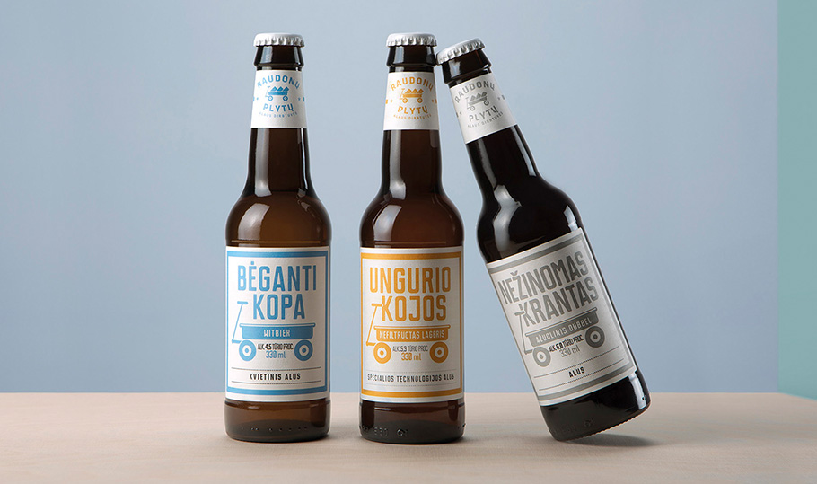
Raudonu Plytu Alaus Dirbtuves | Dec 2013
A visual identity and packaging designs we crafted for the Raudonu Plytu Alaus Dirbtuves (Red Brick Beer Workshop) craft brewery, set up in the 230-year-old red brick Svyturys premises on the shores of the Baltic Sea shore. It is a place where experimentation, play and unconventional raw materials give rise to small batches of beer with unexpected and amazing flavours. The simplistic, joyful design forgoes the fancy beer design tradition, instead relying on the playful nature of the craft beer, while the names of the beer flavours pay tribute to the sea.
Supynes | May 2012
A campaign and visual identity we designed for the Supynes electronic music festival that takes place in the beautiful woods of Aukstaitija National Park.

Small Planet Airlines | Aug 2010
A true 360-degree revamp we did for Small Planet Airlines, from the brand idea and platform to the name, logo, visual identity, plane livery, interior design, host gear design, client service ideas and client service standard, inflight materials, website design, and much more.

Satta Outside Festival | Jul 2009
A multi-awarded campaign we created that brought cult status to the Satta Outside festival and was recognised as Client Of The Year at the Adrenalinas awards. At the time, the brothers were a real creative team at the agency who were briefed to create the campaign. The creative directors could not make sense of their ideas but loved their spirit, so the team became the focus of the campaign.
