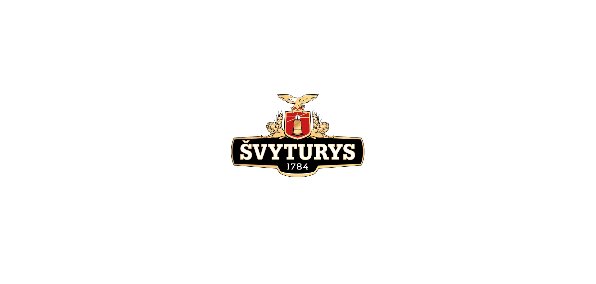
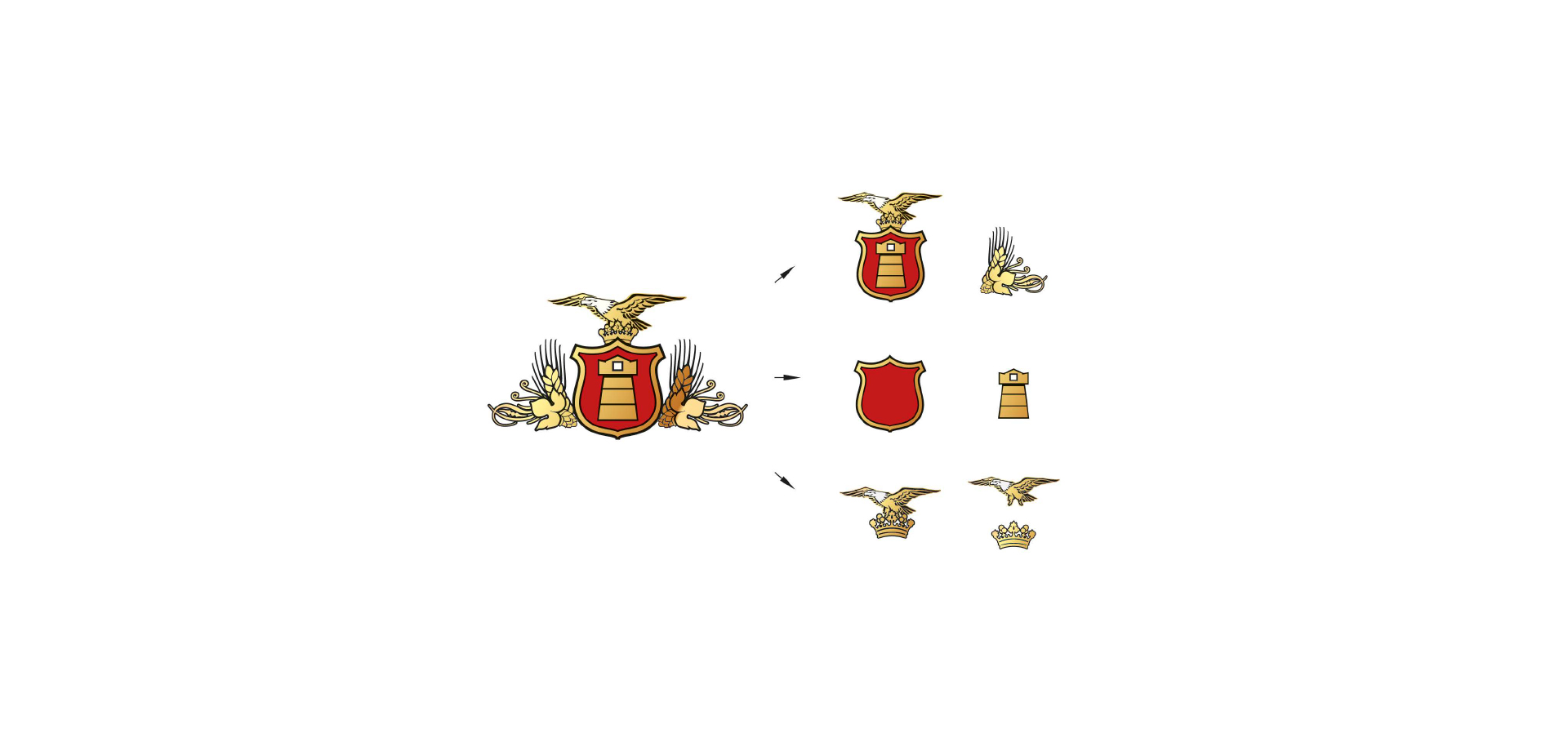
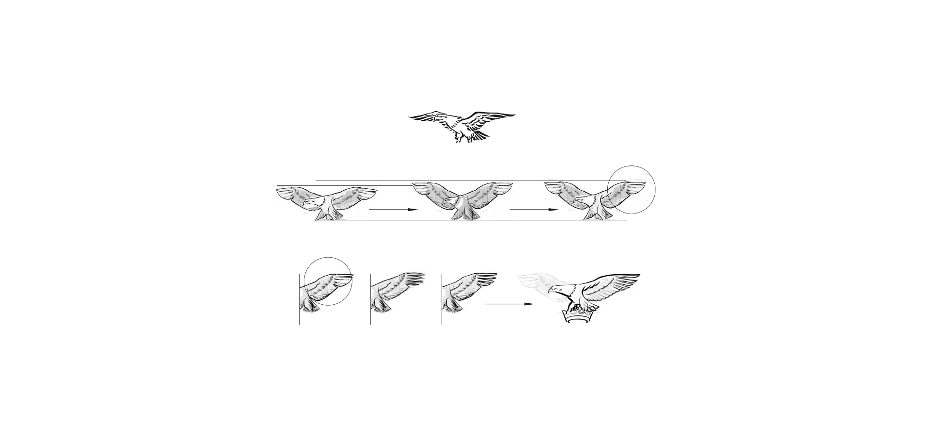
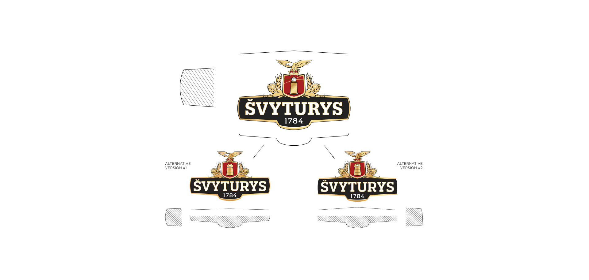
A very delicate design work for an iconic and exceptionally busy Svyturys logotype, aiming to give the logo a modern, quality feel with little to no actual changes to the design. The redesign of the logotype retained the profusion of all the elements, and a great deal of effort was spent improving the comprehensibility of the symbols. Dozens of designs were executed and tested for every logo element from the shape of the eagle feathers to the width, kerning, and outline of the lettering. The style of these elements was modernised and their execution was unified by means of hand drawing. Subsequently, a lot of thought was given to an elegant merger of these elements and a gentle rebalance of the logotype’s priorities to ensure a stronger impact. Finally, the logotype was reproduced in a vector format.
Brand:
SvyturysCategory:
Alcoholic BeveragesType of work:
Visual Identity DesignYear:
2015Office:
Vilnius