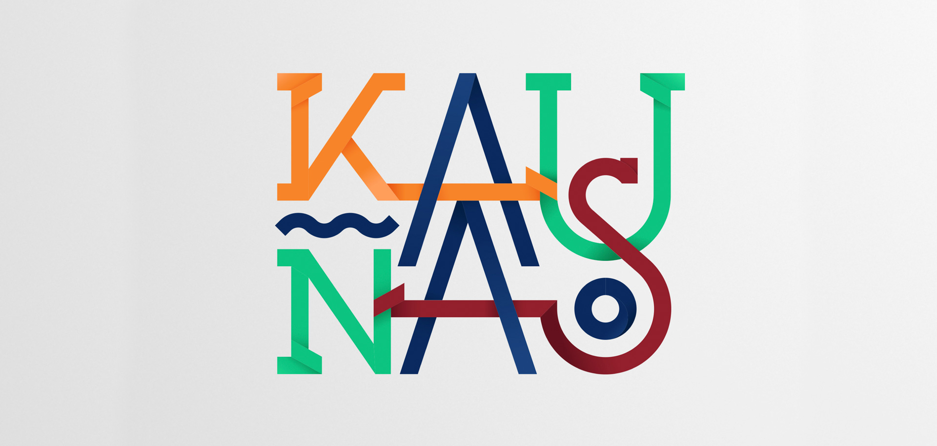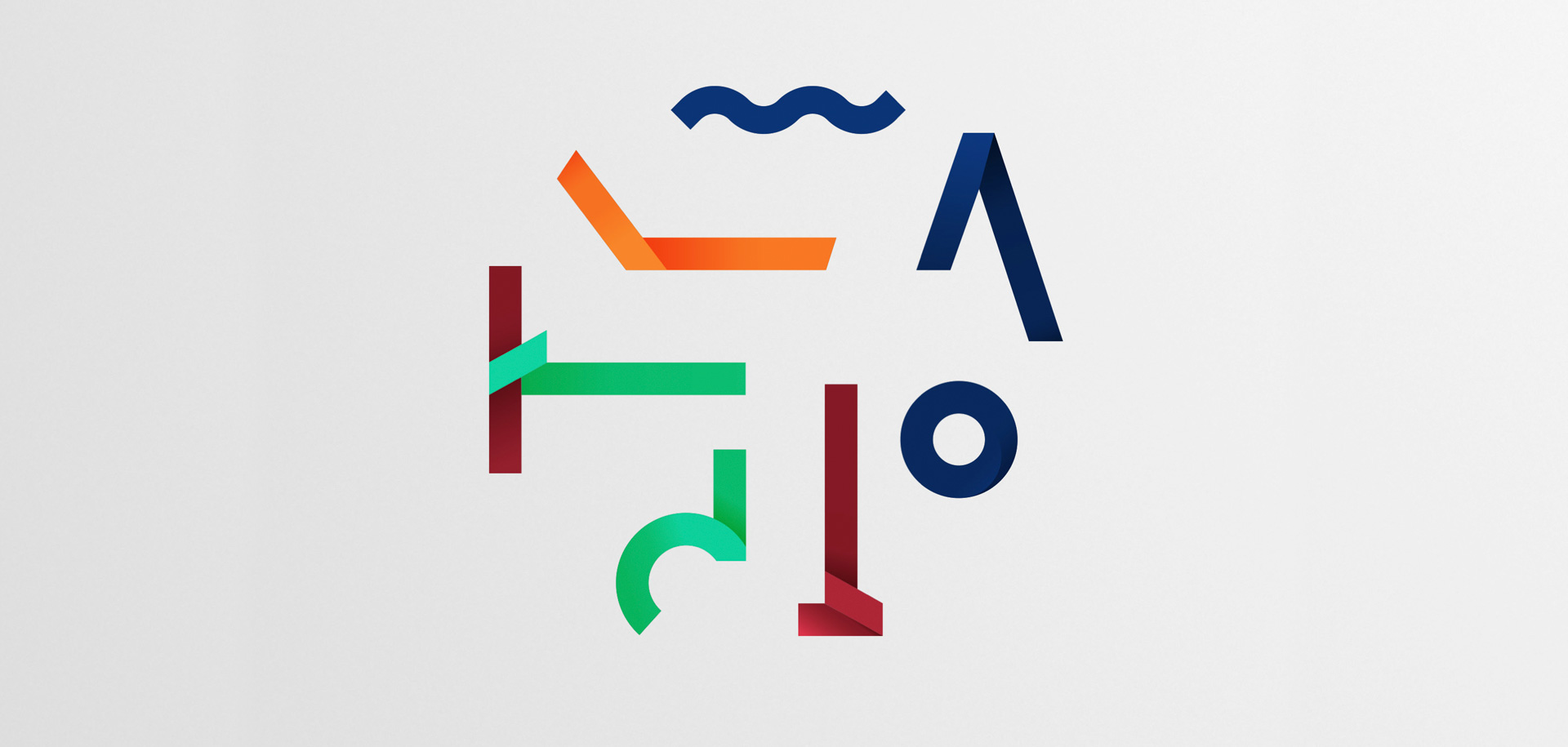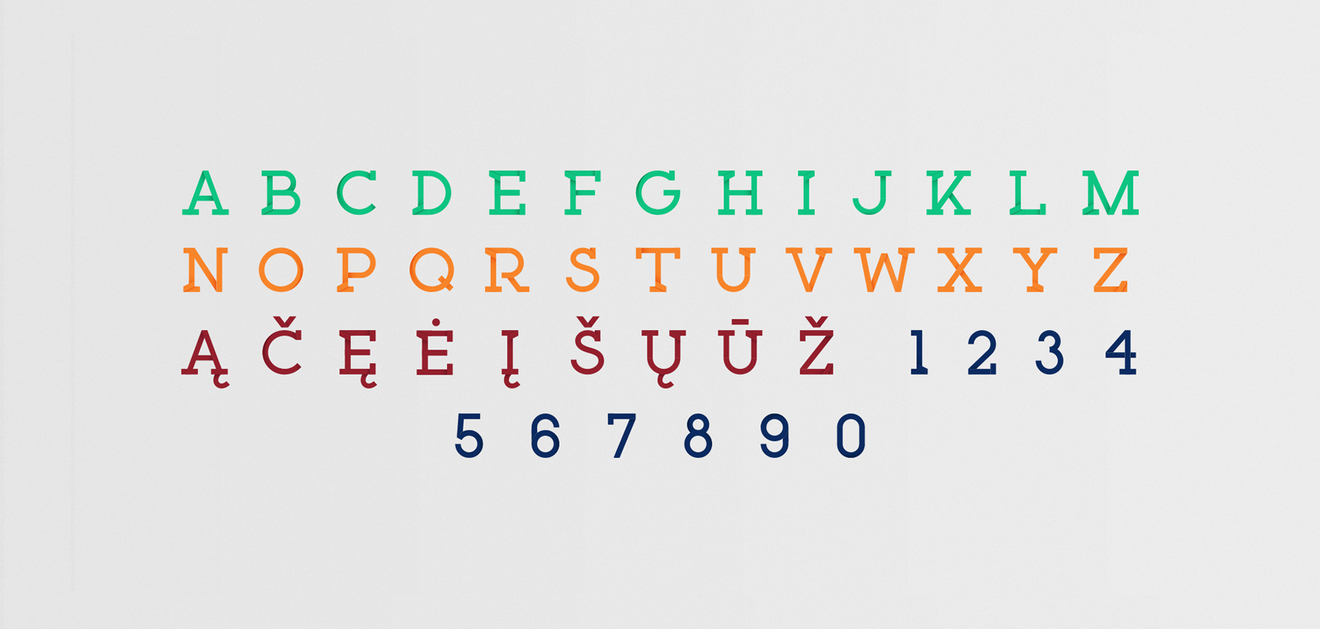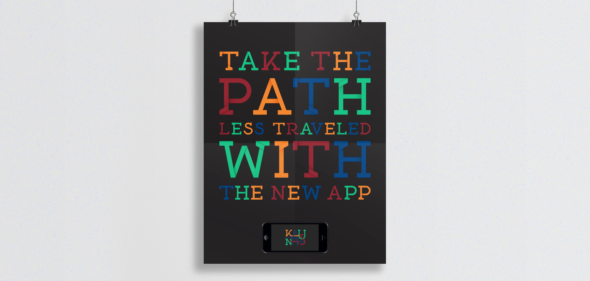
A visual identity system we developed for Kaunas city. The logo of Kaunas is made of stripes in various colours (designed to reflect the different layers of city life, from business to modern culture and from history to sport) that bend, cross each other and interlace. The interlacing design principle underlines the open spirit and versatility of Kaunas city and extends beyond the logo to build a comprehensive visual identity that seamlessly engages with the environment.
Brand:
Kaunas CityCategory:
Public Sector & Not For ProfitType of work:
Visual Identity DesignYear:
2014Office:
VilniusAwards:
ADrenalinas Bronze Arrow in Logo and visual identity designKiev International Advertising Festival Shortlist in Design
White Square 3rd Place in Visual identity