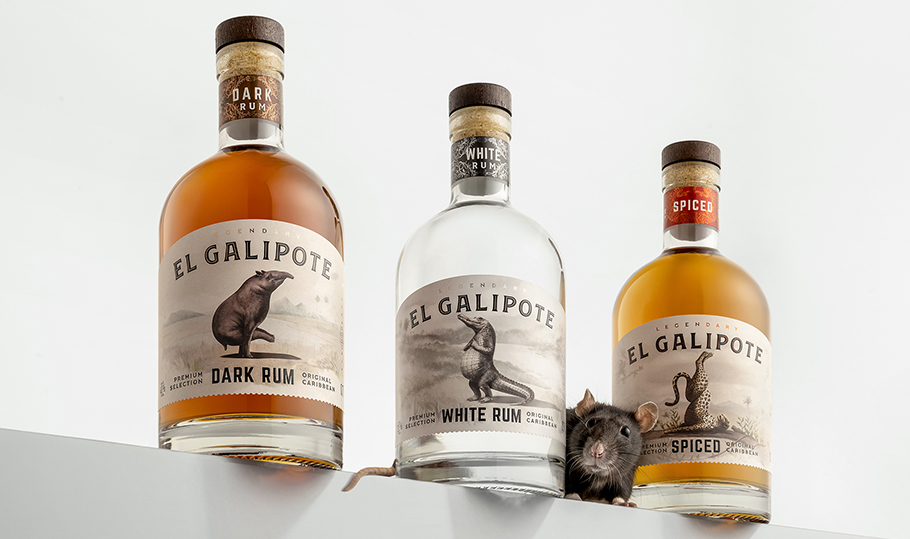
El Galipote | Sept 2024
El Galipote is a mysterious creature wondering the dense forests of Caribbean Islands. Able to transform into human shape and gifted with supernatural powers, it is the source behind countless folk tales and eyewitness accounts. We have used the legend as an inspiration for a new rum brand from Vilniaus Degtine, called El Galipote. For packaging designs, we employed indigenous Caribbean animals that we transformed into animals with human characters.
FILTER WORK

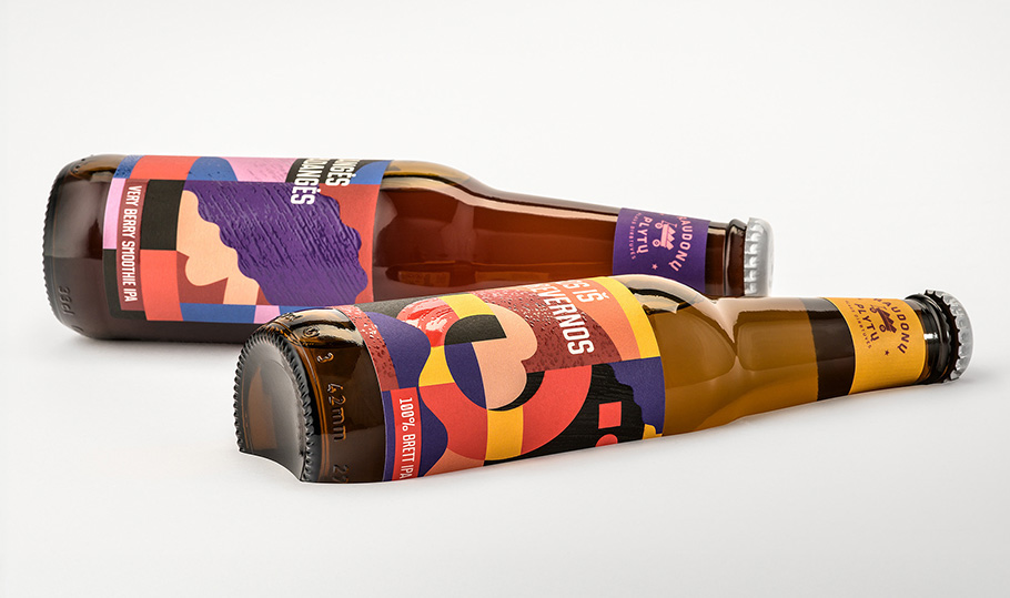
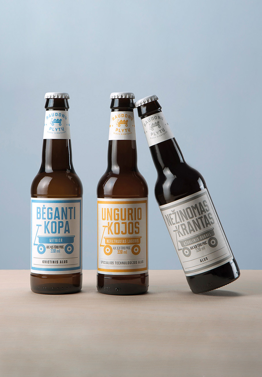
Raudonu Plytu Alaus Dirbtuves | Aug 2024
Names and packaging designs we created for Raudonu Plytu Alaus Dirbtuves limited-edition beer series, brewed specially for International IPA Day 2024. The labels are inspired by geometric symbols once used by Curonian Spit fishing villages on their boats and wind vanes.

Pakruojo Dvaro Bravoras Ir Spirito Varykla | Oct 2023
Paskoline (Loan Bitter in English) is a special drink we created, designed, produced, and got into stores just 72 hours after the sentencing of the former minister of transportation and communications of the Lithuanian Republic, Eligijus Masiulis, in a bribing case. As alcohol advertising is banned in Lithuania, the packaging design had to do the whole job – excite the nation, tell the story, and sell the product, which it did on the very first day.
Raudonu Plytu Alaus Dirbtuves | Aug 2023
Playing with the names of five rivers flowing into the Baltic Sea, we created the names and packaging for Raudonų Plytų Alaus Dirbtuvės’ limited IPA series for International IPA Day 2023.

Mashie | Feb 2023
Hot Power is a first-of-its-kind hot berry power drink from Mashie. We created the packaging line, which employs the animal illustrations historically used by the brand.

Mashie | Oct 2022
A packaging line design we crafted for Mashie hot berry drinks.

Resq | Mar 2022
Resq is a non-chlorine, non-bleach stain remover that is packaged in recycled plastic from Naujoji Ringuva. We came up with the brand name, created the logo and overall brand look and designed the multiple SKUs portfolio packaging.

Raudonu Plytu Alaus Dirbtuves | Aug 2022
Names and designs for a line of special beers we crafted for Raudonu Plytu Alaus Dirbtuves (Red Brick Beer Workshop) dedicated to international IPA day.

Moskovskaya | Jan 2021
We created a limited-edition Moskovskaya sleeve design for the Chinese nightclubs market. The detailed dragon illustration is covered with UV varnish and changes colour under neon lights.

Renaissance | Dec 2021
A line of Renaissance brandies we redesigned packaging for. The labels we crafted were designed for use on a very challenging bottle shape.

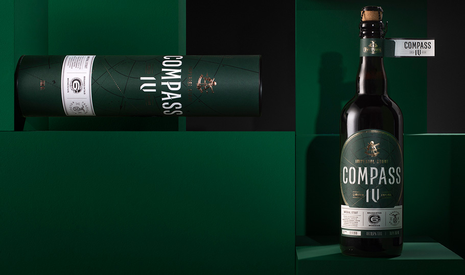
Svyturys | Nov 2020
The packaging design we crafted for a limited-edition Brewmaster’s Selection, a Belgian triple ale from Svyturys.

Svyturys | Dec 2020
The packaging design we crafted for Compass V, a limited edition beer matured for 18 months in bourbon barrels from Svyturys.

Obeliu Crafted Vodka | Oct 2020
A brand name, bottle and label design, as well as a website we created for Obeliu Crafted Vodka, a super-premium vodka from Vilniaus Degtine. This vodka is made from spirits sourced from the Obeliu Distillery, built in 1907 by Jonas Psezdeckis, the last Count of Rokiskis. The front label features a photograph of Countess Katerina Komaraite Psezdeckiene bottling the Obeliu spirits in 1930.

Malsena | Apr 2020
The packaging design for the Malsena pasta range.
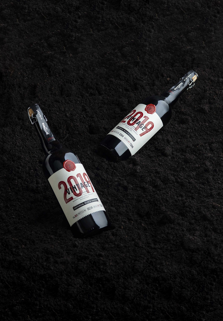
Svyturys | Dec 2019
A packaging design we developed for the 2019 Vintage Imperial Stout, a limited edition beer from Svyturys.
Svyturys | Nov 2019
The packaging design we created for a Compass IV limited edition beer, matured for 6 months in Laphroaig barrels, from Svyturys.

Raudonu Plytu Alaus Dirbtuves | Oct 2019
A name and label design we created for Spicy Mixtape – a limited edition beer resulting from a collaboration between Raudonu Plytu Alaus Dirbtuves (Red Brick Beer Workshop) and Brooklyn Breweries. The drink features a lot of spices, ranging from honey and ginger to red pepper and sweet orange peel.

Pergale | Nov 2019
A packaging design we crafted for the Pergale Unique line of chocolate tablets. The illustrations were created by the artist and zookeeper Lori Dunn.

Raudonu Plytu Alaus Dirbtuves | Oct 2019
A packaging revamp we crafted for the Raudonu Plytu Alaus Dirbtuves (Red Brick Beer Workshop) craft brewery. The new designs are centered on the iconic brick cart, which we introduced on the labels 6 years ago for then-new brewery.

Raudonu Plytu Alaus Dirbtuves | Oct 2019
A name and label we designed for the Banginio Dieta (Whale's Diet) coconut cheesecake stout from Raudonu Plytu Alaus Dirbtuves (Red Brick Beer Workshop).

Moskovskaya | Aug 2019
Bottle and label designs we created for Moskovskaya vodka, which is sold in more than 60 markets worldwide.

Raudonu Plytu Alaus Dirbtuves | Dec 2018
A name, label, wrap and a gift box we designed for the limited edition Buriu Burtai (Sail Spells) chocolate mint stout available from Raudonu Plytu Alaus Dirbtuves (Red Brick Beer Workshop).
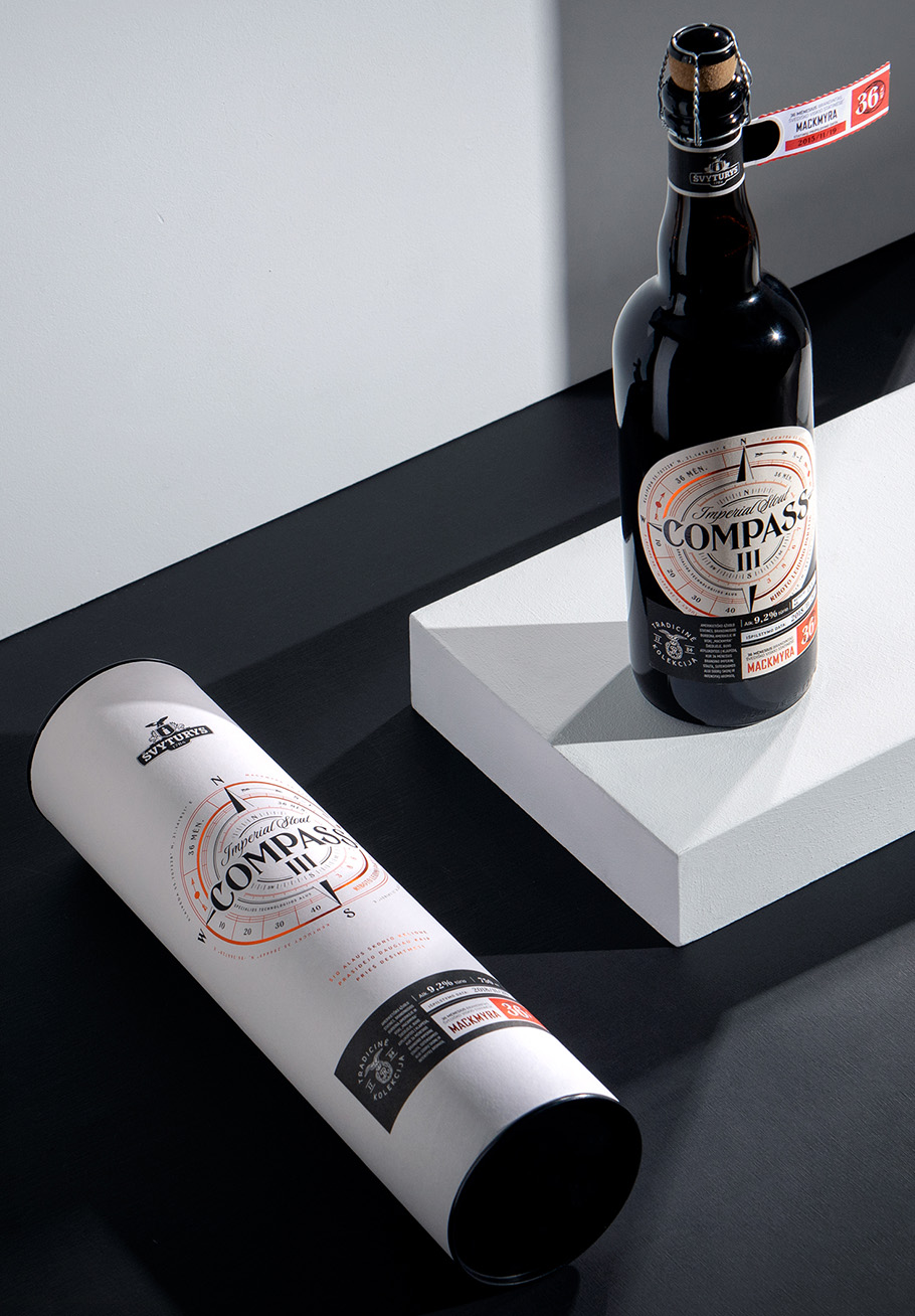
Svyturys | Dec 2018
The packaging design we crafted for the Compass III limited edition beer – a beer matured for 36 months in Mackmyra barrels from Svyturys.

Pakruojo Dvaro Bravoras Ir Spirito Varykla | Dec 2018
The packaging we designed for Eau De Vie De Biere from Pakruojo Dvaro Bravoras Ir Spirito Varykla (Pakruojis Manor Brewery And Distillery) distillery, a distillery committed to bringing traditional liquors from the Baltic region to the public.

Coffee Address | Aug 2018
A brand name, visual identity design and line of packaging we developed for the house-blend roasted beans from Coffee Address.
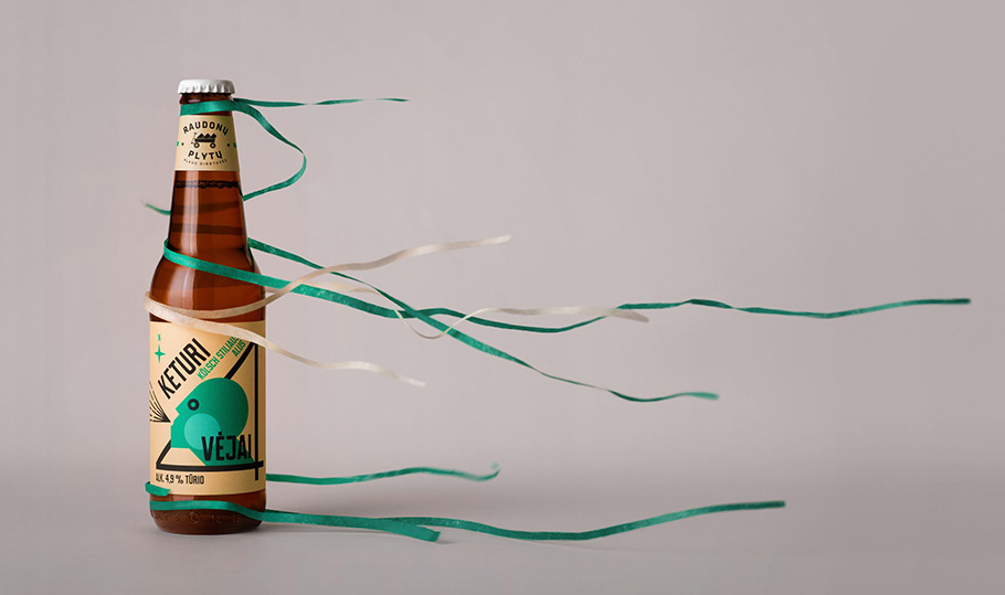
Raudonu Plytu Alaus Dirbtuves | Oct 2018
A name and label design we created for the 4 Vejai (4 Winds) German ale from Raudonu Plytu Alaus Dirbtuves (Red Brick Beer Workshop).

Raudonu Plytu Alaus Dirbtuves | Mar 2017
A name, label design and online video we developed for the limited edition Juroje Supasi Lempa (Lamp in the Sea) beer, created for the Kino Pavasaris film festival by Raudonu Plytu Alaus Dirbtuves (Red Brick Beer Workshop). The malt for this beer was dried under a 4.1 kW cinema lamp and the label was coated in ultraviolet dye, making its appearance change once exposed to ultraviolet (and cinema) light.

Rasa | Oct 2017
The packaging we designed for a limited-edition Rasa hand cream. This hugely popular design reached over a quarter of a million of people organically and generated more than ten thousand reactions on Facebook with a single post from the parent company BIOK Labaratorija. It became the most successful limited-edition product for the company, generating +71% more sales than in the same time period the previous year.

Alkimikis | Mar 2017
Packaging we created for the main product line at Alkimikis – a microbrewery in the heart of Riga run by Gordon Van Houtan, an American architect turned Latvian beer brewer. The label designs explore Gordon’s philosophy of science and art.

Melt Water | May 2016
Glass and PET bottles and 30+ SKU labels we designed for Melt Water. This super-premium bottled water is produced via a proprietary technology that mimics the natural formation and melting of glaciers, which involves a complex, multistage process of freezing, extracting and melting the “core” ice.
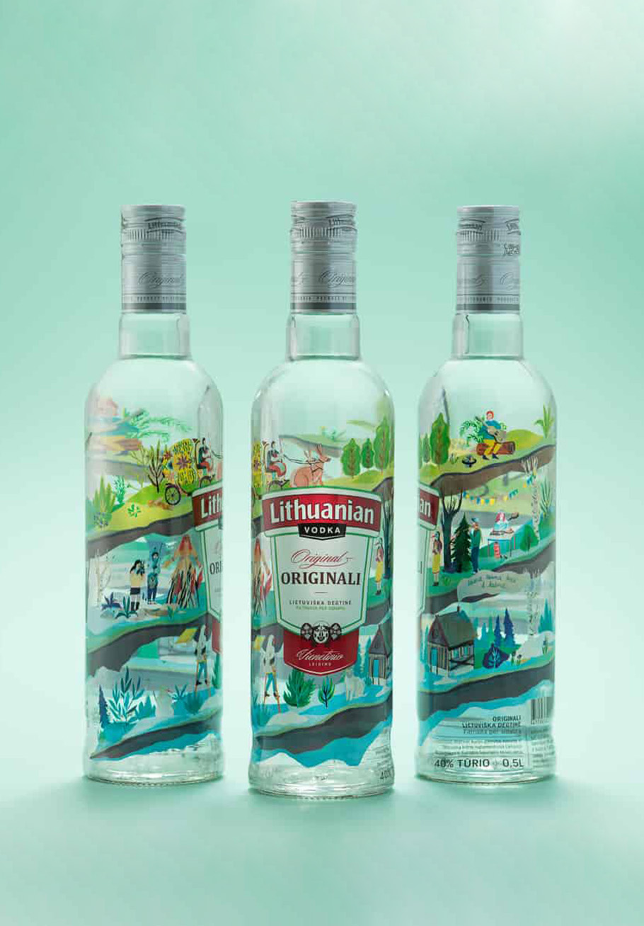
Lithuanian Vodka | Feb 2016
A limited-edition seasonal packaging we designed for Lithuanian vodka. The naïve illustrations were inspired by the folk patterns found on traditional window shutters and explore traditional Easter themes including Pancake Tuesday and the Fair of St Casimir.

Raudonu Plytu Alaus Dirbtuves | Nov 2015
A name and label we designed for a limited edition beer from Raudonu Plytu Alaus Dirbtuves (Red Brick Beer Workshop) called Jam Session. 10 tons of birch sap went into this very special beer, which was brewed together with the legendary Garret Oliver of Brooklyn Breweries fame.
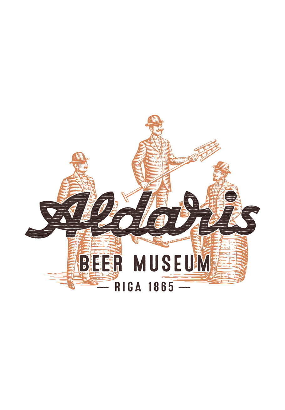
Aldaris | Apr 2015
A special visual identity we developed for Aldaris Alus Darbnica. It was inspired by the legendary European Brewers Congress that took place in 1906, where one hundred brewmasters from Europe met at the Waldschlosschen Brewery (the historic name of Aldaris) in Riga to discuss the secrets of their craft. The visual identity was specially developed for the museum’s purposes and is used for special small-batch beer packaging produced on the museum’s premises.

Saules Pienas | May 2015
A packaging design inspired by the interwar period we crafted for the Saules Pienas (Sun Milk) line of dairy products from the Lithuanian retailer Maxima.
Raudonu Plytu Alaus Dirbtuves | Dec 2013
A visual identity and packaging designs we crafted for the Raudonu Plytu Alaus Dirbtuves (Red Brick Beer Workshop) craft brewery, set up in the 230-year-old red brick Svyturys premises on the shores of the Baltic Sea shore. It is a place where experimentation, play and unconventional raw materials give rise to small batches of beer with unexpected and amazing flavours. The simplistic, joyful design forgoes the fancy beer design tradition, instead relying on the playful nature of the craft beer, while the names of the beer flavours pay tribute to the sea.

Svyturys | Jul 2014
A paper wrap we crafted for Svyturys Memelbrau beer bottles, inviting people to purchase the beer with 5 cents from each bottle going to replenish the Curonian Spit forest that had burned down. The illustration on the wrap depicts the tragedy of the Curonian Spit fire and was created with coal from burnt trees located on the actual site. More than 50,000 pine trees were planted with the money raised through this campaign.
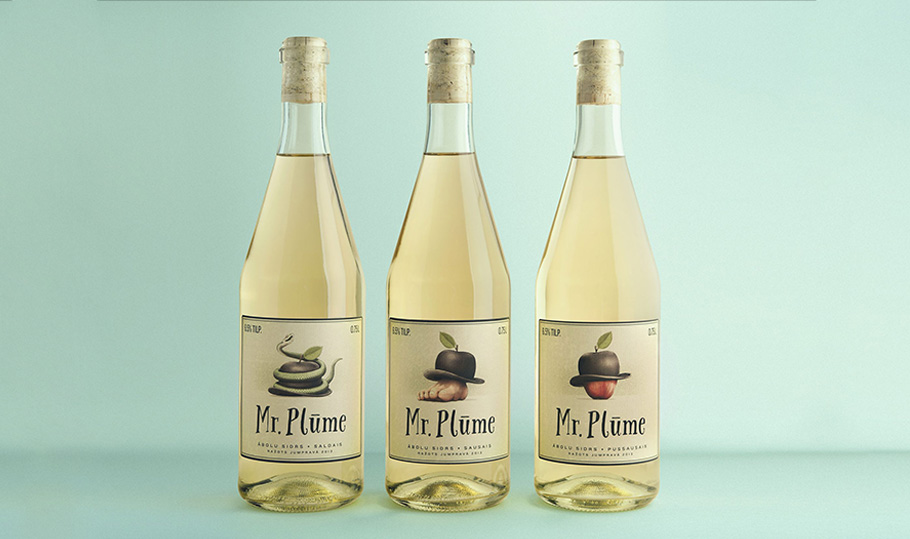
Mr. Plume | Nov 2013
The brand name, visual identity and packaging we developed for Mr. Plume, a cider created by a Latvian musician who learned cider brewing in Austria and returned to his home city of Jumprava to produce his own ciders. We also helped Martin Plume to win a financial grant on the TV show ‘Company Secret’ to kick-start his business. As the name Plume sounds very much like plum, a lighthearted and paradoxical brand name was employed – Mr. Plume – for a cider made by a plum guy. A ‘Mr.’ bowler hat was shaped for the brand logo that is reminiscent of an apple.
